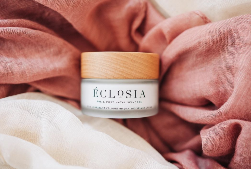
Eclosia est une marque française de soins naturels, pensée pour accompagner les femmes à chaque étape de la maternité. Les produits, formulés avec exigence, invitent à un moment de soin intime et réconfortant.
L’identité visuelle s’inspire du cycle de transformation et d’épanouissement, au cœur de la maternité. La fleur, et plus particulièrement la pivoine, chère à la fondatrice, devient le point de départ du concept : une forme en devenir, symbole de douceur, de croissance et de renouveau.
Le logotype s’appuie sur une typographie élégante et rassurante, venant équilibrer un pictogramme délicat. Ensemble, ils composent une identité à la fois sensible et structurée.
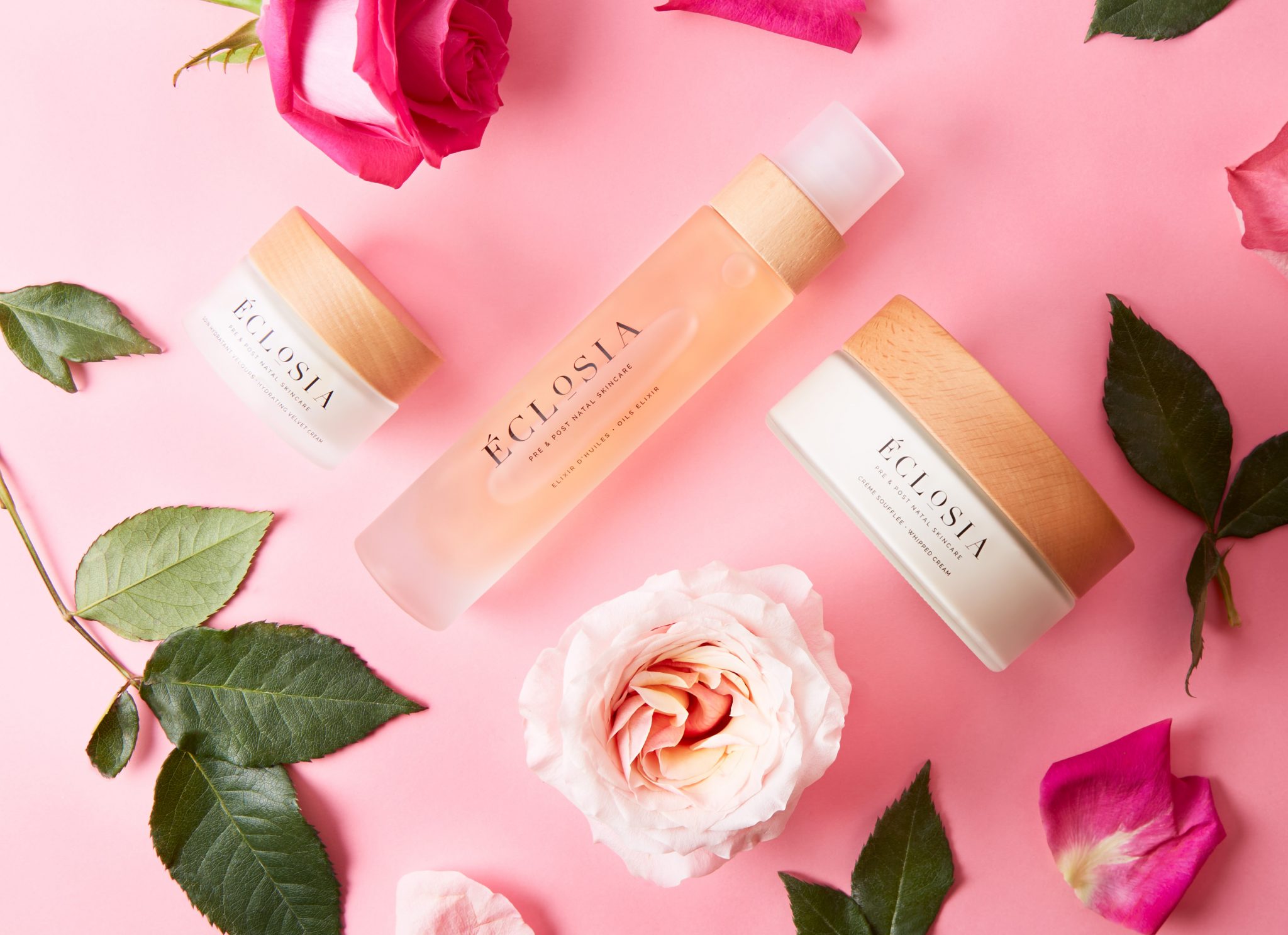
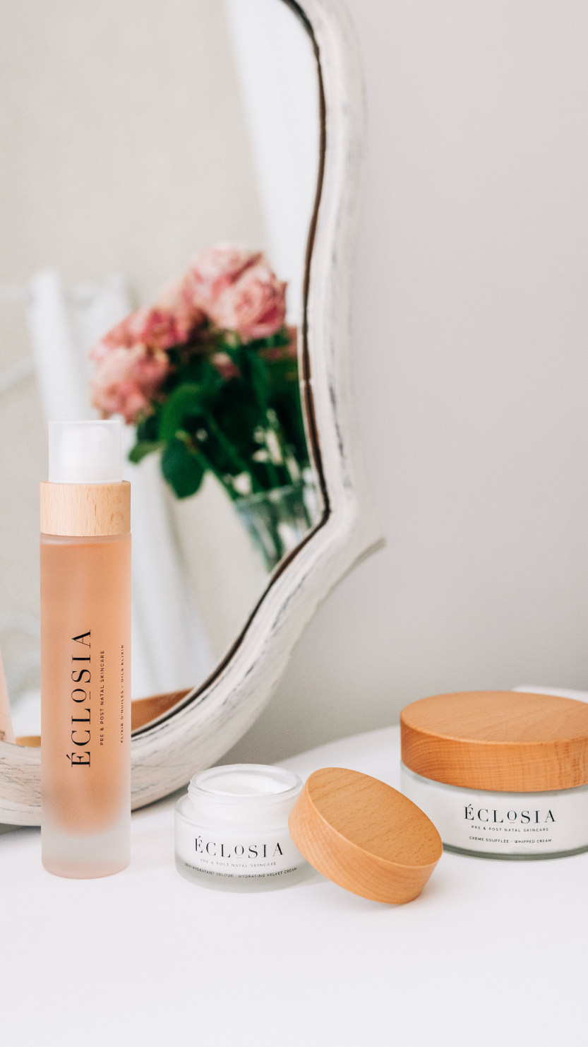
La palette de couleurs, douce et subtile, accompagne des packagings en verre et bois, renforçant la dimension naturelle et qualitative de la marque.
Une identité conçue pour traduire un moment suspendu, entre soin, douceur et transformation.
Scope Identité visuelle — logotype — direction artistique — packaging.
Éclosia is a French natural skincare brand designed to support women through every stage of motherhood. Thoughtfully formulated, the products offer a comforting and intimate self-care experience.
The visual identity is inspired by the idea of transformation and blossoming at the heart of maternity. The flower , particularly the peony, the founder’s favorite, became the starting point of the concept: a symbol of growth, softness and renewal.
The logotype is built around an elegant and reassuring typeface, paired with a delicate pictogram. Together, they create a visual identity that feels both refined and structured.
The color palette is soft and subtle, complementing the glass and wood packaging, and reinforcing the brand’s natural and premium positioning.
An identity designed to embody a moment of pause, where care, softness and transformation meet.
Scope Brand identity — logo design — art direction — packaging.