MAISON KĀRYA
direction artistique, branding marque & packaging
Karya est une maison contemporaine basée à Hong Kong, qui élève le snacking au rang d’objet de désir.
À travers une sélection de noix sourcées avec exigence, la marque développe une approche presque couture du produit.
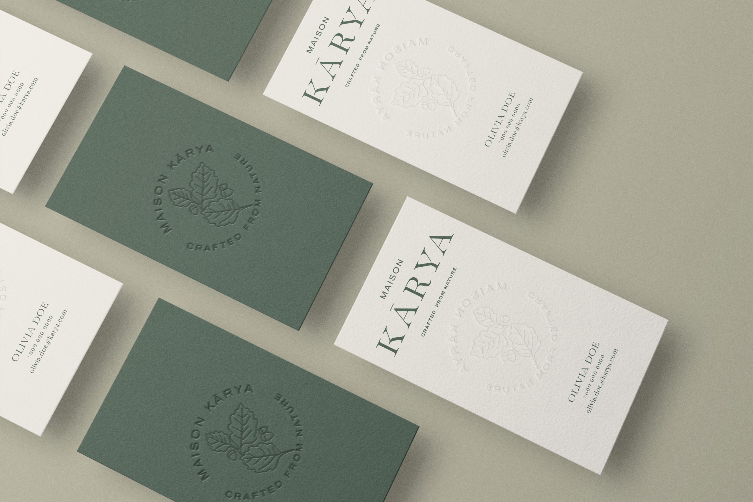
Le nom Karya trouve son origine dans le grec ancien karyon, signifiant “noix”, une graine qui porte en elle vie et force. Depuis toujours, les noix incarnent des trésors cachés de la nature, à la fois simples et essentiels.
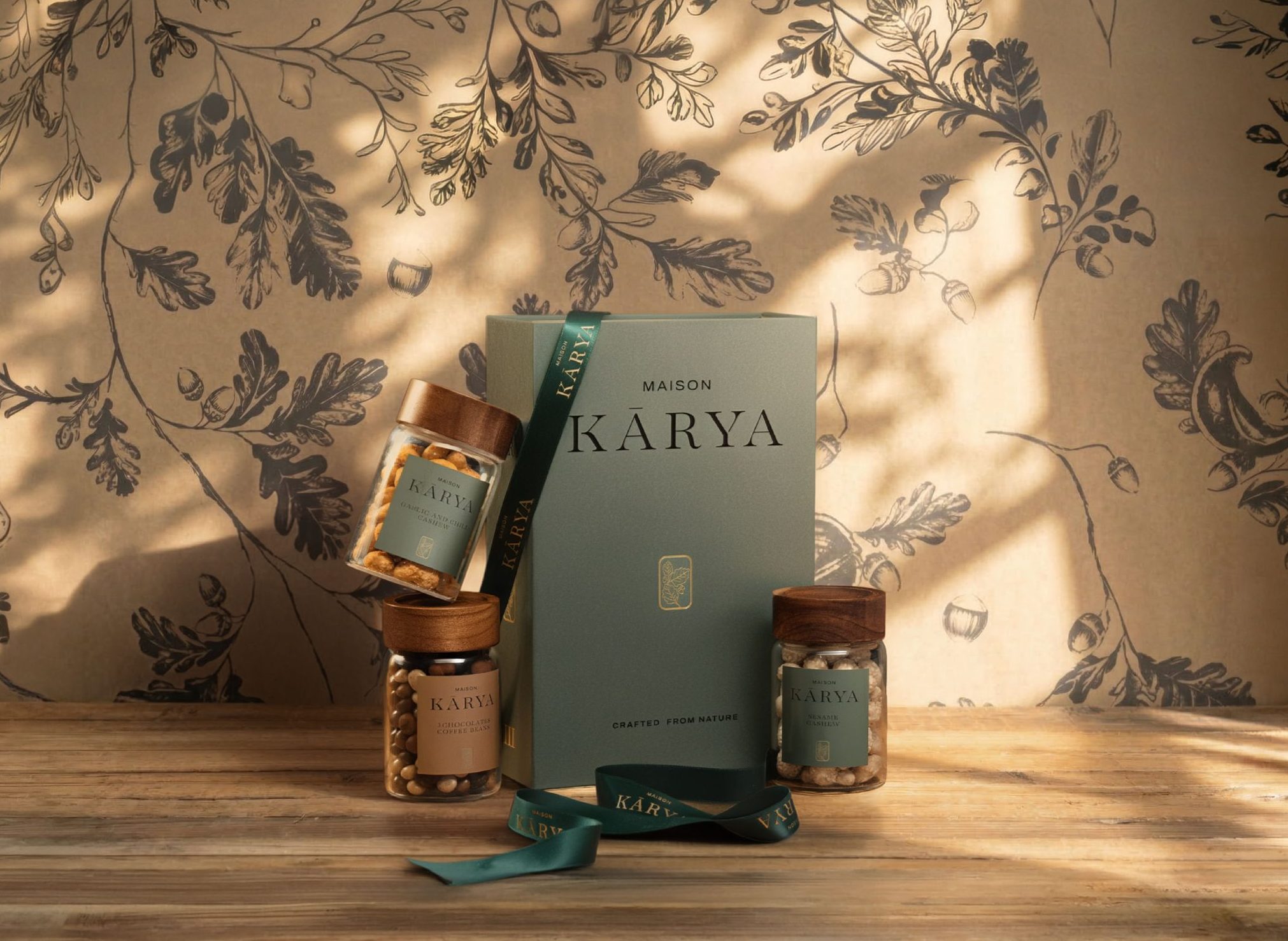
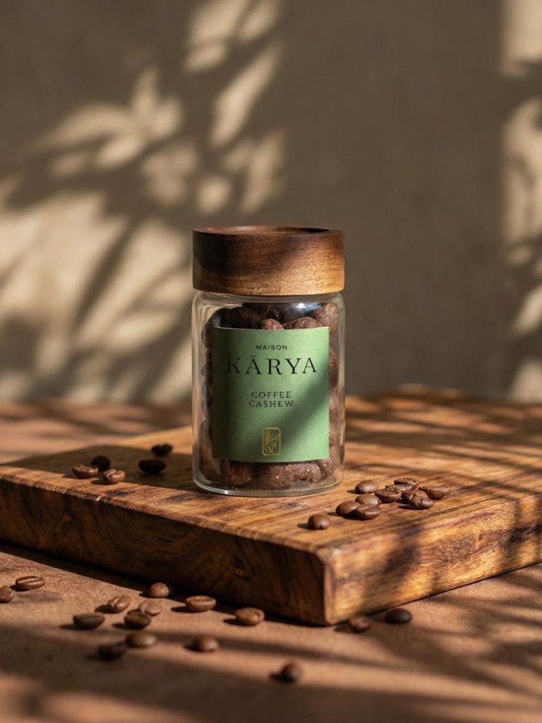
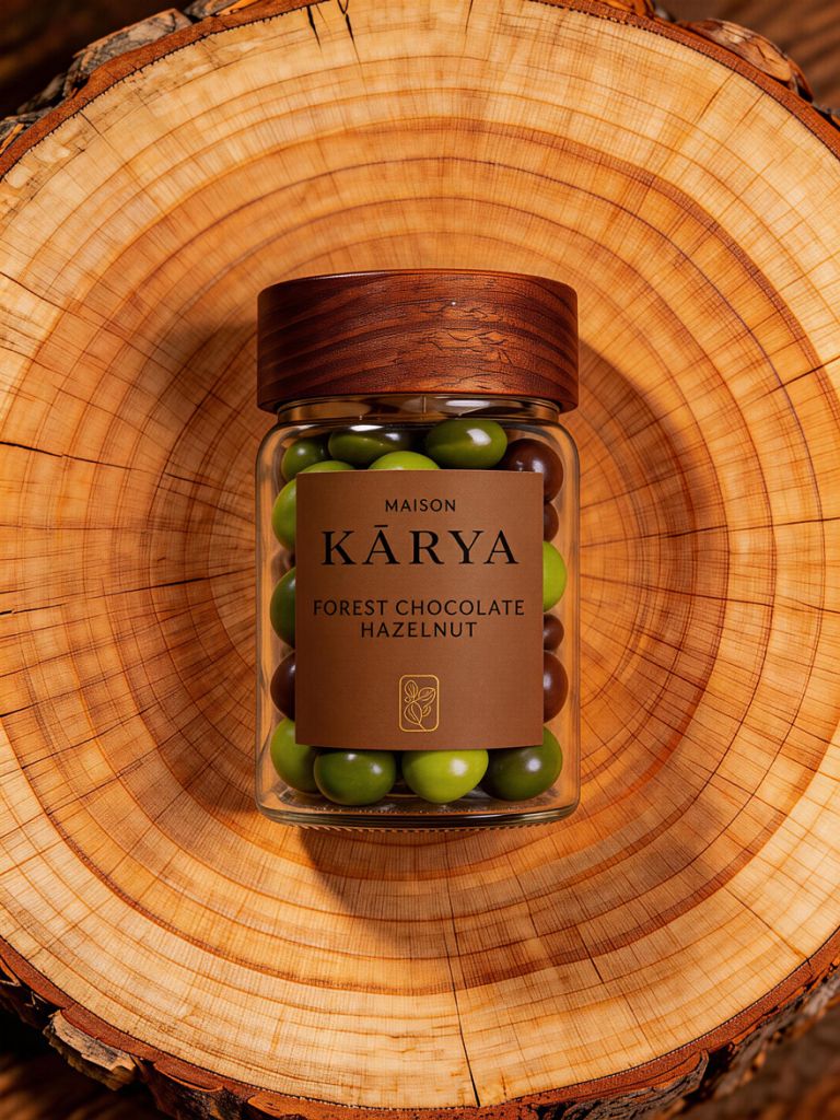
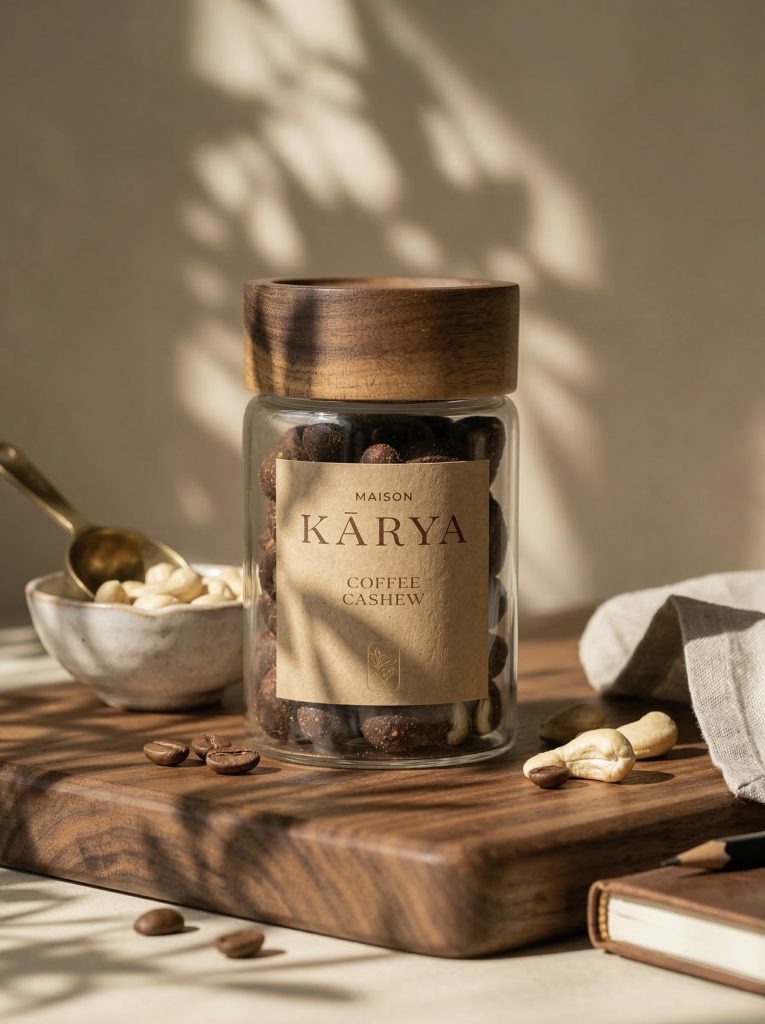
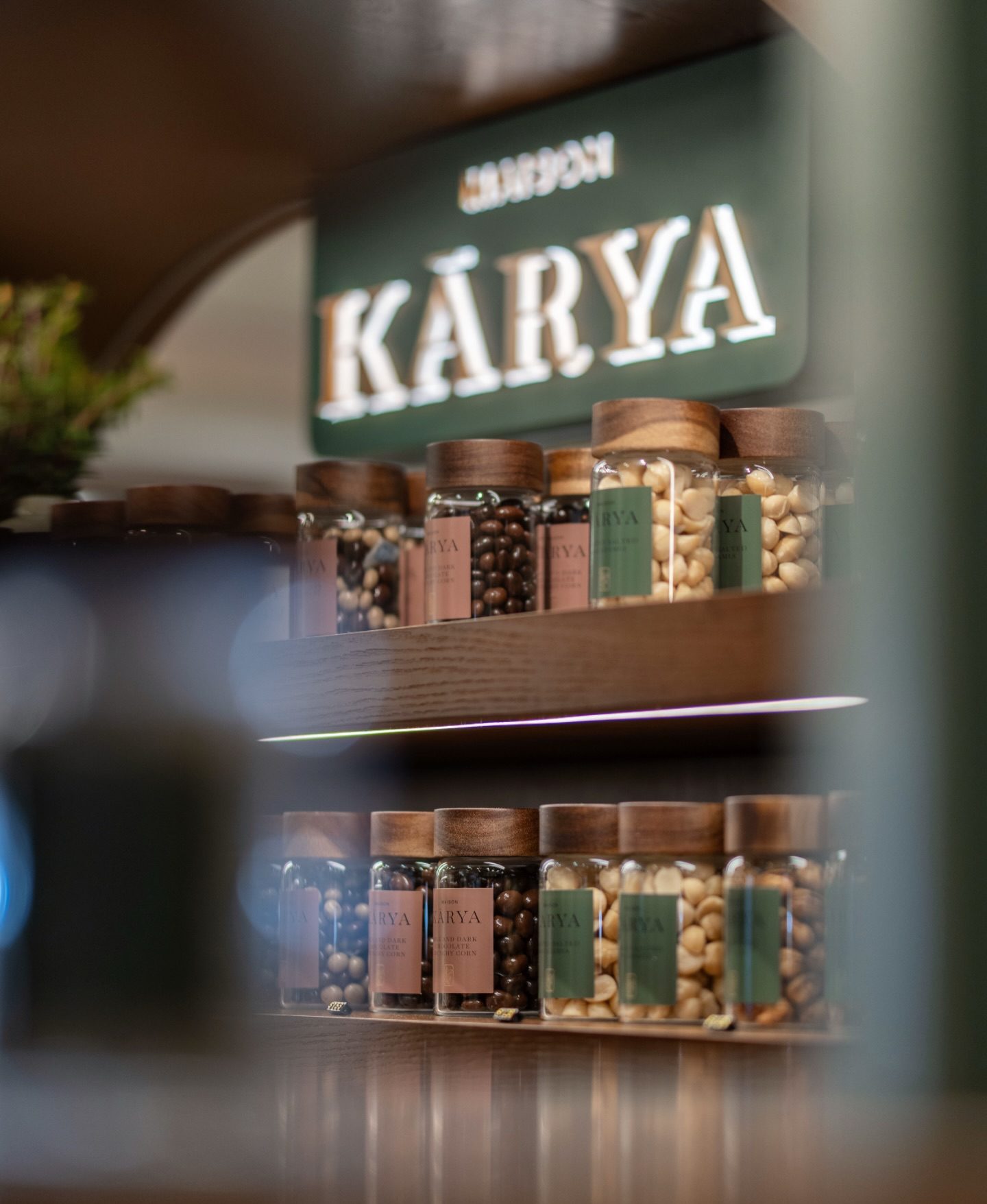
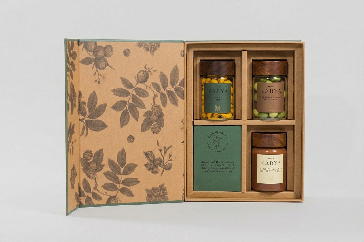
La signature “Crafted from Nature” exprime le cœur de la marque : des produits sélectionnés à leur apogée, présentés avec le soin d’un artisan. Associée à des contenants en verre aux lignes épurées, elle installe un dialogue entre transparence, modernité et élégance.
La direction artistique s’est construite comme un véritable territoire de marque, pensé dans sa globalité. Au-delà de l’identité visuelle, un travail de fond a été mené sur le storytelling afin de créer un univers cohérent, sensible et durable.
Le logotype, élégant et maîtrisé, s’inscrit dans une écriture à la fois discrète et affirmée. Il dialogue avec un système graphique épuré, laissant toute la place à la matière et à la richesse naturelle des produits.
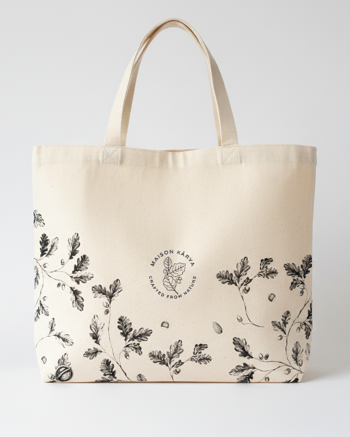
Le packaging occupe une place centrale dans l’expérience : conçu comme un objet, il transforme chaque boîte en pièce à part entière. Trois illustrations ont été développées, chacune associée à une gamme, apportant rythme, singularité à l’ensemble. Elles se prolongent sur différents supports, dont un tote bag, renforçant la dimension lifestyle de la marque.
Une identité à la croisée du food et du luxe, où simplicité et sophistication coexistent avec justesse.
Scope
Direction artistique — identité visuelle — storytelling — packaging — illustration — papeterie — accompagnement créati
Kārya is a contemporary Hong Kong–based house that elevates snacking into an object of desire.
Through a curated selection of premium nuts and dried fruits, the brand approaches its products with a couture-like sensibility — where taste, texture and aesthetics are considered as one.
The name Kārya derives from the ancient Greek karyon, meaning “nut” — a seed carrying life and strength within its shell. For centuries, nuts have symbolized nature’s hidden treasures: simple, essential, and deeply valuable.
The tagline “Crafted from Nature” expresses the essence of the brand: ingredients selected at their peak and presented with the care of an artisan. It speaks to purity — untouched, unaltered — while “crafted” conveys intention and refinement. Paired with sleek glass jar packaging, it evokes a sense of modern elegance and transparency, transforming a simple product into a sophisticated, nature-inspired experience.
The art direction was developed as a complete brand territory. Beyond the visual identity, a strong focus was placed on storytelling to create a cohesive, sensitive and lasting universe.
The logotype, both elegant and restrained, is built on a refined typographic foundation — subtle yet distinctive. It is supported by a minimal visual system that allows the richness of the ingredients to take center stage.
Packaging plays a central role in the experience: conceived as an object, each box becomes a piece in itself. Three original illustrations were created, each tied to a specific range, bringing rhythm, character and desirability to the system. These elements extend across various touchpoints, including a tote bag, reinforcing the brand’s lifestyle dimension.
Every detail was designed to create a refined and cohesive experience — from first glance to the act of tasting.
A brand identity at the intersection of food and luxury, where simplicity meets sophistication with precision.
Scope
Art direction — visual identity — storytelling — packaging — illustration — stationery — creative direction


