MAISON PERNETTE

Cocon d'évasion

Nichée au cœur du Beaujolais, Maison Pernette a été imaginée comme un véritable cocon d’évasion au milieu de la nature. Cette ancienne maison rénovée offre un lieu de séjour chaleureux et apaisant, où l’attention portée aux matériaux, aux textures et aux détails crée une atmosphère douce et raffinée. Un spa nordique vient compléter cette expérience de déconnexion.

Le nom Pernette est un surnom régional donné à la coccinelle. Ce symbole a naturellement guidé la création de l’identité visuelle.

Le logotype a été conçu comme une forme protectrice évoquant un cocon. À l’intérieur se dévoilent subtilement les initiales M et P, dissimulées dans un jeu de feuillages délicats, accompagnées d’une coccinelle. L’ensemble crée un symbole à la fois poétique et ancré dans la nature environnante.

La palette de couleurs s’inspire directement du paysage : des tons naturels, doux et organiques qui prolongent l’atmosphère paisible du lieu.

Scope
Identité visuelle — logotype — direction artistique.

A nature retreat

Nestled in the heart of the Beaujolais region, Maison Pernette was envisioned as a peaceful escape surrounded by nature. The renovated house offers a warm and calming retreat where thoughtful interior design, beautiful materials and subtle details create a refined atmosphere. A Nordic spa completes the experience of slowing down and reconnecting.

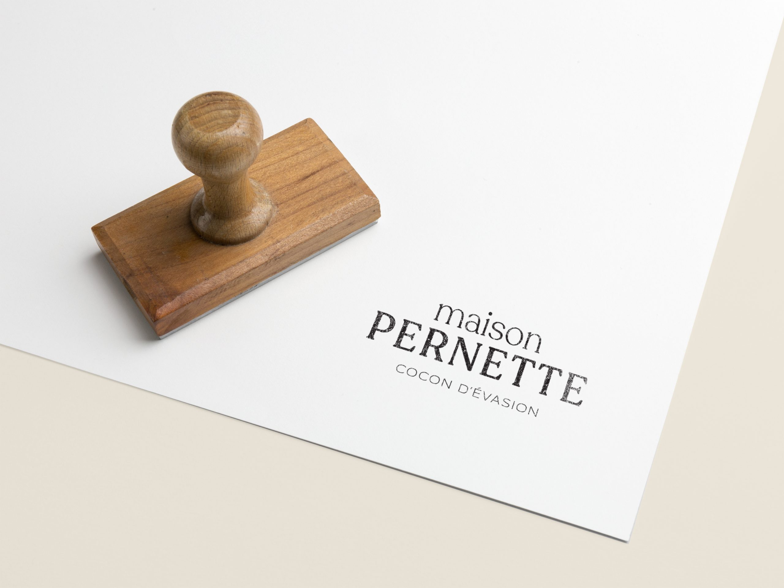
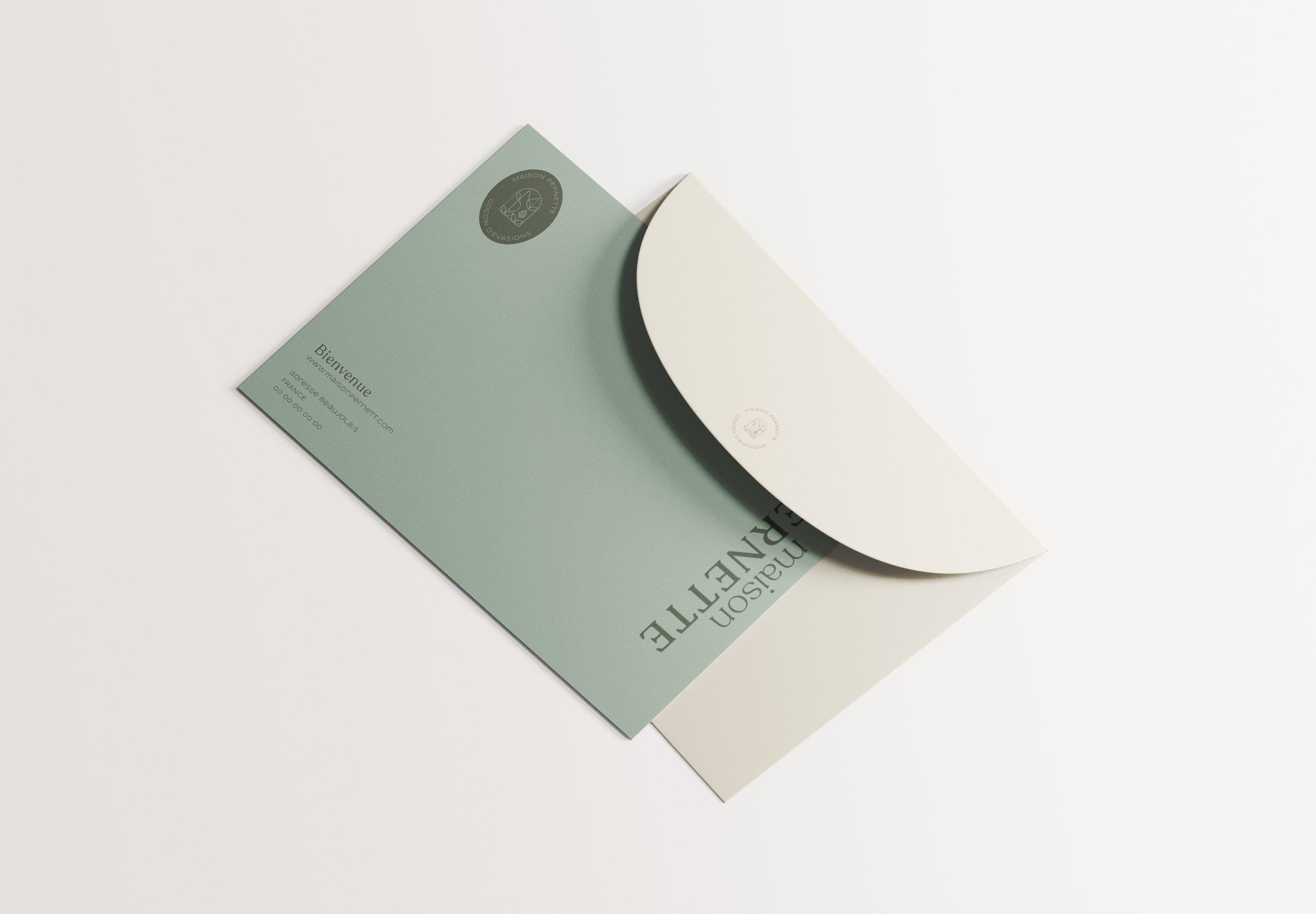
The name Pernette is a regional nickname for a ladybug, which naturally became the inspiration behind the visual identity.

The logo was designed as a protective shape evoking a cocoon. Within it, the initials M and P subtly emerge through delicate foliage, accompanied by a ladybug. Together, these elements form a poetic symbol rooted in the surrounding natural landscape.

The color palette draws directly from nature, with soft organic tones that extend the serene atmosphere of the place.

Scope
Brand identity — logo design — art direction.